Thursday, March 11, 2010

An Ode to Wine


I tasted a wine that delighted me. Not too far from our studio, located atop the Santa Cruz mountains, is a gorgeous winery retreat that over looks the valley (Thomas Fogarty). I was tickled by their 2007 Estate Grown Santa Cruz Mountains Pinot Noir. It has a unique element of spice and light tannins yet is so delicate and fruity. This pinot is truly recognizable and distinct, and we snatched up two bottles and will undeniably go back for more. Easily drinkable on its own - it was a beautiful find.

Thomas Fogarty Winery was started by a Stanford cardiovascular surgeon and has one of the most enormous and fantastic views of the valley. The drive to this spot is windy and serene. We had a picnic here and relished the gorgeous views of the vineyards, the valley and the bay.

Remember this wine! Thomas Fogarty 2007 Estate Grown Santa Cruz Mountains Pinot Noir


Wednesday, March 3, 2010

Photons, waves and psychology, oh my! Color and your mural.


Color is complicated, there's no doubt about it. We all studied color and light waves in grade school. Color can change in virtually every situation, and what may look red at night may look magenta in the morning hours. Your upbringing and the country you were born in may influence your ability to see different colors.

Color is dependent on 3 participants: a light source, an object and an observer (you). If any one of these changes, the color may look different. Viewing conditions (daylight, incandescent lightbulb or fluorescent as well as the colors that surround the color you're judging) are all important when viewing color. However, when viewing images on a monitor, we must understand phosphors and what they mean to the color that appears.

What is a phosphor?

A phosphor is a chemical and mineral compound that emits light when struck by a beam of electrons. Your monitor contains thousands.

How can phosphors represent color differently?

The type of phosphors used, their age, characteristics of the monitor (ie brand, brightness, etc.) can influence the color that your monitor produces. Color can vary on screen by all these variables, and we match the prints to our own monitors.

Although color is different on every single monitor, this doesn't necessarily mean that you are going to receive a print that's far off the mark. Exact colors are extremely difficult to match when the color sources are different (print versus screen, etc.) so if you're trying to make an exact match, we do offer samples of any image that we offer on the website. Call us for details.


Monday, February 8, 2010

Wall Art - a Smash Hit


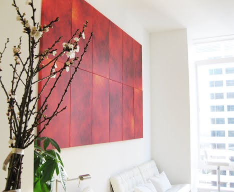
Here is a photo of the finished product (plus four more panels) hanging in the client's home which I wrote about in the previous post. The finished product measures 9 feet wide and over 5.5 feet tall. This is an interesting twist: the client chose to hang all the panels next to each other with out spacing, and it looks great! Note: this was a custom design and cannot be ordered on the website, but call us for details. All of the products on the website are made so that the panels hang 2-3 inches from one another.

Love the white furniture - shows fantastic contrast.

Monday, February 1, 2010

New Office Dog!


We just adopted Onyx, a retired racing greyhound, a few weeks ago. What a great asset to the company, he is the sweetest! Greyhounds are nicknamed "The 45 mile an hour couch potato" and it is definitely fitting. Onyx is only 2, and we're so happy to have him here. Welcome Onyx!

Monday, January 25, 2010

Huge mural for modern loft apartment!

We just did this custom layout for a client in San Francisco. In it we used the same artwork (Art 2264), repeated 4 times. The art is abstract enough, so we flipped it and cropped it in different areas, making a fantastic final piece. What a great idea!

The final dimensions of the wall art was 6.5 feet wide and 5.9 feet tall (this includes spacing in between the tiles) making a huge statement. It's really striking up on the wall, we had to hang it
in the studio just to get photos. You can get creative and combine any size you want, just like this client did. To get ideas, go to the Oversized section on the website, http://www.modernmural.com/OversizedModernWallArt. These are just examples, so you can combine any number of tiles with different layouts.

Gorgeous!

Monday, November 23, 2009

Hanging Contemporary Wall Art in Large Spaces


With oversized wall art, it's sometimes difficult to know how high or low to hang it. To be honest, a lot depends on the space in which you're hanging the artwork. The height of the ceilings, the number of pieces you are hanging, the size of the artwork as well as what's in the room can help determine the best possible viewing space for your mural. Most of our artwork is large and can be somewhat intimidating to hang, so kindly take note.

I found this great article on how to accomplish this! Check it out: http://interiordec.about.com/od/artindecorating/a/Gwheretohangart_2.htm. Steps 1-3 are especially pertinent. Here's a quick summary of points I liked:

1. Hang artwork higher in places where you'd normally stand, such as a hallway or entryway. Hang artwork lower in a room where you'd normally sit.

2. Relate the artwork to things around it. With large artwork, hang so the bottom of the artwork is 6-12 inches from the top of the furniture.

3. If you're hanging tall artwork, place it so that the top 1/3 is near eye level.

Best of luck! As always if you have any questions, please feel free to call or email us. (1-866-316-9481, info@modernmural.com) Cheers!


Monday, November 9, 2009

How to Hang Oversized Wall Art

Hanging large wall art (more specifically hanging multiple panels of artwork) shouldn’t be the cause of your waking nightmares. I, too, have had the disappointing visual of sporadic pencil marks and nail holes peeking from around the artwork I just hung up. We can conquer! And it’s really easy. So here we go…

1. Make a pattern/template from a paper painter’s drop cloth (make sure it’s paper – less than $5) found at Home Depot or other hardware store.

2. Spread the paper open on the floor and arrange the panels as you’d like them to hang on the wall. For the wall art arrangements we sell, each row will be hung at the same height. Use a ruler or tape measure to make certain that they are aligned correctly. I find it best to first arrange panels on a large table or floor as you’d like them to hang on the wall. Measure the same height for all panels both horizontally and vertically with the necessary spacing. We recommend a 2-3 inch space between all panels. This allows for easy viewing. (Note that the panels we sell are packaged in order with #1 on the top and in the same orientation for convenience. Sometimes it’s hard to tell which way is up with abstract art.)

3. Once you have the wall art laid out and measured, trace the outside of the frame. With the canvas prints, it’s better to make small marks around the 90 degree corners of the frame as to not mark the canvas. Make a mark with your pencil within the tracing where the nail will be placed once the frame is hung.

4. Remove the frames from the paper. Pin or tape the paper sheet to the wall, ensuring that both ends of the paper are hung at the same height. Hammer the nails into the marks for the nail holes directly through the paper. Tear down the paper, or save for later. Once it’s removed, you are left with glorious aligned nail holes! Hang up the wall art.

See? No sweat. Now it’s time for 30 Rock!

Next: Hanging contemporary wall art in large spaces. How high/low do I go?