Thursday, October 21, 2010

Relaxing in the Comfort of Your Dentist's Office?

Sounds like an anomaly, but it's possible! One of our clients took these photos for us. She did a superb job incorporating some soothing wall art and great color into her client's office. She also took advantage of the Customize Your Own on the site to tweak the location of the lone tree in Art 2261. All 3 pieces are 34"x34" Canvas Giclée and make really nice standalone pieces as an affordable way to display modern wall art.

Thank you to Susan D. Nord of designsbynord.com for providing the photos!


Friday, October 15, 2010

Existing for everyone, all in the name of love


Colourlovers.com is dedicated to color, more specifically, palettes of color which are submitted by color lovers from the world over (and almost a half million followers). All in the name of love.

You can love and comment on any of the content on the site, and believe me, people are passionate about what looks good and what doesn't. One of my favorite features is the section on color trends in fashion, web, print, business and more. To designers out there, check out the Business Trends section for really nice palettes. I come to this site when I need inspiration for my design - few palettes leave much to be desired, but I always find a boat load of great color combos.

If you're going to be creating your own piece and uploading through our site colourlovers will help you create a slick piece of wall art. Enjoy!

Friday, October 1, 2010

In the fight between you and the world, back the world.


Discovered Mister K this week - how gorgeous, alluring and somehow a bit melancholy. This font was created in reverence of Franz Kafka. The type seems to echo his streams of consciousness and is periodically interrupted with expressive pictographs. My favorite font this week.

Wednesday, September 15, 2010

Musée d'Orsay Collection and Other Impressionist Works Make Their Only Stop in North America at the de Young Museum


Found some must-do's in art this week! If you're in the San Francisco area, check out the exhibit "Impressionist Paris: City of Light" at the Legion of Honor. Gorgeous luminescent works explore life in Paris during the 19th century from the Fine Arts Museum of San Francisco and prominent private collections. Through September 26.

This exhibition is running simultaneously with "Birth of Impressionism: Masterpieces from the Musee d'Orsay" at the de Young Museum (Sept 26 - Jan 18 2011). The Musée d'Orsay in Paris houses the largest Impressionist and Post-Impressionist art collections in the world. The de Young is this collection's only stop in North America. Definitely worth the trip, as you will see the the works of the most influential Impressionist painters such as Van Gogh, Gauguin and Cezanne, among others.

I'll be headed there next weekend to explore. Impressionism is a crowd pleaser - the lighting techniques that were predominant are chewy and palatable; but you must see the paintings in person to experience their sumptuousness and grandeur.

Who is your favorite Impressionist?

Tuesday, August 24, 2010

Lost & Found: Inspiration From Retro Illustrated Advertisements


I found a gem blog that I know you'll like too. Today's Inspiration features advertising illustrations from decades past, mostly beginning in the 1940's. It was so fun going through the pages and pages of fantastic drawings - ads from Time magazines, fashion drawings, oil company ads - we see many now that try to replicate what was created then, but these just have so much magnetism. From famous illustrators to not so famous ones.

Monday, August 23, 2010

Modern Wall Art to Soothe the Weariest of Souls

Super-soft delicious textures: are you in?

The portfolio of one of our contributing photographers, Florene, is modern, clean and super macro. The wall art created from her work fits in so eloquently to any space because of its organic motifs and natural colors. Her photos are mostly botanical - some boast golden bamboo forests, soothing rippling water, delicate veins of tropical plant leaves, unruly straw-like bark from palms and many other raw subjects inspired by her native Florida.

What makes Florene's work so uncommon is that she takes what is ordinary to her surroundings and creates modern wall art with rich luscious colors, soft textures and warm emotion that could soothe any weary soul. At the macro level the imagery becomes abstract enough for your mind to fill in the blanks but still creates a satisfying composition.

Among my personal favorites are:

Orange Angles (Art 2919): Very nice macro of flame colored palm leaves. Notice the sharp crisp edges of the leaves and the 3-d texture. The color makes it yummy.

Looks especially good in 2-34"x18" rectangles and 24"x56" rectangle.


Mesh of Gray (Art 2943): Interesting silver background with black mesh in the foreground. The uniformity of the lines are tranquilizing but the viewer still keeps interest due to the imperfections in the weave.

Looks especially good in 6-18"x18" squares and 2-18"x34" rectangles.


School's Out (Art 2956): Small silvery fish dart (mostly) vertically in whimsical play. I love the subdued colors of this piece, which at first appear to be warm grays with splashes of indigo dollops of paint. As you investigate more closely you catch the detail of eyes, spines and tails. Really cool photo.

Looks especially good in the 56"x24" rectangle where we catch light reflecting off the fish which creates a shimmer at the bottom of the piece.


World Up Close (Art 2973): macro of a tropical plant leaf. The title is fitting since the colors and shapes are reminiscent of a satellite image of Earth. We see lime colored veins running through the leaf and it's mesmerizing. This one is probably my favorite from Florene's collection.
Looks especially good in the 8-18"x18" squares and the 34"x34" square.

Many items ship free. Check out Florene's portfolio here and experience the clean gorgeous wall art from modernmural.com.

Friday, August 20, 2010

Best Selling Art of the Summer


It's difficult to pick up on seasonal trends when wall art will hang in your space year round. However, I'd like to feature some of the hottest selling art of the summer so far. Although we are seeing a liking for neutrals, some of the best sellers are pretty bold. The trends show everything from graffiti (Art 2665) by one of our French artists, Martine, to bold and bright photographs of flax and cherry colored Japanese umbrellas (Art 1587 & Art 1569) by another French photographer, Phinecoree. In an urban illustration titled "The Last Kiss" we see the just the legs and feet of two lovers stretched up to kiss one another good-bye in front of a subway train (love this one). There are many organic subjects, as well. Martine's piece "Automnal" is reminiscent of cracked glass, with gorgeous autumn colored leaves showing through. One of our photographers from Halifax, NS, Jewels, captures a lone tree capable of evoking even the faintest of memories.

The art is produced in most sizes on the modernmural.com, so check out the links to see availability!
As seen left to right, starting with top left corner: Art 2665, 1569, 1587, 166, 2550, 2053, 1015, 1935, 2378


Tuesday, August 17, 2010

Edward Tufte: Beautiful Evidence


One of the best ways to look at data is through fascinating visual ways. I was turned on to Edward Tufte's work a few years back. His design is clean, eloquent and simply put, beautiful. Tufte is a world famous statistician who also teaches political and computer science at Yale. He is most famous for his undertakings of Information Design, and very eloquently describes quantitative information through drawings, graphics and sculpture. In a world with innumerable data, Tufte finds ways to expose profound relationships through visual means. Interestingly enough, in March of this year he was appointed by President Obama to the American Recovery and Reinvestment Act's Recovery and Independent Advisory Panel to reveal how recovery money was being spent.

Check out more on Tufte's website.


Thursday, July 29, 2010

NEW fabric wall hangings now available!


They've finally arrived. Affordable, stylish, elegant and articulate - fabric wall hangings will impress. Nature inspired motifs bring tranquility and cheer to your space, with beautiful whimsical patterns and hip designs. They're available in 6' or 8' lengths and feature sleek aluminum holders and stainless steel hardware. Eco-friendly inks on plain weave fabric. Check them out on modernmural.com for more details!

Friday, July 16, 2010

Create your own custom sized artwork

You're looking to beautify your walls but you need more or less than what we have shown on www.modernmural.com. We create wall art for any sized space; rule of thumb is we can do anything as long as it's in multiples of the standard tile sizes on the site. At 1.5" thick and gallery wrapped on 100% cotton canvas, it's affordably priced - call us for details!

Shown here is Art 2632 in qty 3 of the 34"x18" tiles.


Thursday, July 8, 2010

sweet artwork for the extra large spaces


You're wondering how to fill up a 20' wall with one image and you want crisp exact quality. You'll want to use vector artwork, which will fulfill this need you once thought impossible. Vector artwork is illustrative, and typically artsy and conceptual. It is based on a mathematical formula and therefore can be exponentially enlarged without sacrificing any quality. We've got a lot on modernmural.com, check some out from a few of our artists: Nicemonkey and MightySmasha. You'll find fine lines, brilliant colors and intricate designs.
Photo above is Art 2903, Orange on White, and is vector artwork.

Thursday, May 27, 2010

Featured Artist: Susan Riddle


I had a moment to ask Susan Riddle, one of Modern Mural's contributing
artists (a brilliant abstract painter), some things about herself: check it out!

MM: Where do you live?
SR: In Aptos, CA, a very laid back, quiet town just a few blocks from
the beach. It can be really mysterious and foggy.

MM: Where do you go to think creatively?
SR: To my garden, where I find colors, textures and composition. I like
seeing it go through its stages during the year. It's death and regrowth.

MM: Who are your design influences?
SR: Gorky, Kandinsky, Rothko, Frankenthaler, Miró and all children's art.

MM: What's your favorite piece of art that you've produced?
SR: It changes all the time, but if I had to pick one it would be a piece I did
called "Imaginary Dreams" because it was totally unplanned. Usually, I
determine the colors I want or the layout I want, but this one was just flowing.


MM: What's one of your favorite leisure activities?
SR: Riding my bike by the beach and gardening.

MM: What is your favorite color to paint with?
SR: Red, because it goes great with yellow and orange (which are my 2nd and 3rd favorites. I've also been getting
into gray to offset the "happy". My college professor always used to say to me, "Your work is too happy -
get some gray in there!"

MM: What's your favorite dessert?
SR: Definitely strawberry shortcake.

MM: What message do you want to convey through your work?
SR: Joy and happiness.

Friday, May 21, 2010

BBQ weather - decorate outdoors!

Warmer weather = grilling & BBQ...what's a girl to do when she wants to invite friends over for a backyard feed? Decorations are covered here (thanks to Martha, you can find how-to tips here.) Have a fantastic weekend!


Elegant white balloons and lanterns prove themselves a hit; votives decorated with real leaves.

String of lights with glued seashells add ambience; makeshift canopy adds intimacy.

Dual vases with tinted water in between creates a dreamy ambiance; shaded string lights glow.

Sunday, May 16, 2010

The coolest cake cutter - ever.

I've been eyeing this cake cutter/server for a number of months now. It makes cake cutting and serving a cinch by cutting straight down then squeezing the handle to lift the piece! When I first discovered it last year, it was not yet on the market, but now it's for sale on Amazon.com. Created by Finnish designer Maria Kivijärvi combines the perfect form & function with lovely clean lines.

Saturday, May 15, 2010

Dwell on Design LA - we'll be there!

We recently reserved our spot for Dwell's design convention! We'll be Booth 924. Dates are June 25-27. If you're in or around the Los Angeles area, stop by - we'd love to meet our customers!

Wednesday, May 12, 2010

Halifax: abundant textures

We have several photographers from Halifax who exhibit beautiful textures and both brilliant and subdued colors. The simplicity of the context is extraordinarily captivating. The natural and man-made textures are captured expertly, and there is nothing more intriguing than that.


Because of its rich history, Halifax has bountiful texture all seeding from old naval yards natural formations on the coast. This texture is what caught our eye - peeling paint, rusty bolts and smooth ocean rocks. They make extraordinary modern wall art.


Halifax is known for its beautiful harbors. In 1749 Governor Edward Cornwallis and 2500 settlers created Canada's first town on the picturesque shores of the world's second largest harbor. Its geographical location on the Atlantic made it an entry point of immigration into Canada and Halifax later became the primary North Atlantic base for the Royal Navy.


Friday, May 7, 2010

All Natural Ginger Martini


Ahh, blissful summer. I've had my share of ginger martinis, and just recently started looking for an all natural recipe - the warm sun just makes me crave them!

Among my stipulations for martinis are: no sweet & sour mix, no Rose's lime juice, no weird sugary additions. (Ginger has many health benefits, check it out here.) Just pure and clean ingredients. I found a few, although I made some slight adjustments to my preferences:

All natural ginger martini
2 oz vodka
Juice of ½ lemon or lime
1/8 tsp fresh grated ginger
½ oz organic agave nectar
Splash of extra-dry vermouth (if you like it)

Shake all ingredients in cocktail shaker with crushed ice for 15 seconds. Serve Up in a martini glass. Garnish with lemon or lime twist.

Enjoy - and drink to your health!

Thursday, May 6, 2010

Featured Material: Canvas


(6 months ago we changed the canvas we offered to one with a heavier weight that visually offers a richer and more substantial surface for displaying wall art.)

The canvas we use for your wall art is 100% natural cotton which gives an organic texture to your mural. The matte surface ensures fantastic image quality, and at 22 mil provides a substantial heavy weight canvas. Beautifully gallery wrapped edges are precision folded.

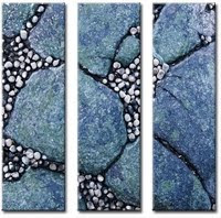
Because the canvas is 100% natural cotton you can see and feel the texture of the fabric with out detracting from the finished product. See photo.

It's made for long-lasting art reproductions - which means that you won't see edge cracking and gives undoubtedly superior print quality.

Friday, April 30, 2010

Clouds for Computers - What Two Very Different California Communities Have in Common


For students living in East Palo Alto, CA, life is challenging. In 1992 East Palo Alto had the highest per capita murder rate in the country, at 42 people murdered with a population of 24,322 people. Poverty seemed to be imminent for its residents and the community struggled with low academic performance. East Palo Alto was relatively untouched when the Dot.com boom surged the economy for the rest of the Bay Area in the early 2000's. During this past recession the town suffered a much higher unemployment rate than the rest of the country.

Sounds daunting, right?

It has been. However, projects headed by concerned community members are striving to improve the life of the residents of East Palo Alto, particularly that of the children. I was clued into one in particular, Clouds for Computers, which aims to connect the neighboring wealthier community of Palo Alto with East Palo Alto through art and technology.


Clouds for Computers is the brainchild of local San Francisco artist Peter Shaw. Shaw works with children at Costaño School, among others in the area, creating cloud paintings. The paintings are based on Peter's own series "100 Blue" which consists of a progression of perfect blue squares that graduate from barely perceptible to nearly black. Their precision indicates the accuracy that technology offers. In an effort to emulate "100 Blue" each student receives a 16"x16" canvas, acrylic paint and a brush and creates his or her own interpretation of the California clouds. The art materials were donated anonymously. Children from neighbor community Palo Alto are also creating their own cloud paintings. The paintings from both communities will be hung side by side - bridging the gap, in many more ways than what is seen. Dozens of tiles are hung, creating one large mural masterpiece and emulating the expansive sky that exists above all of us and across every community. The goal is to create 1000 California Clouds paintings, and already the count is 700.

The story doesn't end here. Peter has plans to scan all of the paintings along side the children so they can learn the process of digital art and reproduction. The process is an important one and links the two communities through digital means. Amazing for the kids!

I had the opportunity to see the paintings and to speak with Shaw and some of the students who are taking part in the project. Peter is extremely passionate about teaching the children the process of art to technology as well as social means of communication. The end goal is to sell the reproductions of the paintings to raise money for laptops for the children at East Palo Alto schools.


Thursday, April 29, 2010

Come Draft with Us - Sustainable Bicycle Gifts

Along with pleasant spring skies and sunny days perfect for biking season comes a plethora of Bike-Inspired Design – everything from bicycle gear clocks to rehabbed furniture made from bikes, this has got me rearing to get my own butt in gear!
Make space instantly! I found these very practical and minimally designed ceiling hoists for your bike – perfect for small spaces that require the edgy charm of a bicycle. Simply mount to the ceiling, hook on both ends of bike and with each pull it clicks to lock. Best part: they’re supremely affordable and sell for around $15. Some homes boast fancy light fixtures, why not exhibit your Trek? Available at Amazon.com.
Waking up to the tick tock of a bicycle clock may just help you get out of bed to hit the trails! Made from recycled gear parts and chains, this sets up a playful yet functional conversation piece. Besides being made from sustainable recycled materials, even the non-biker would appreciate its cool design. Available at BrightandBold.com.
Hip vintage bicycle art is a fantastic way to brighten any space. This wall art is available in several different sizes, on a green or white background. Features both canvas and framed art, printed with eco-friendly inks and mounted on sustainable wood. Framed art starts at just $55. Available at ModernMural.com.
Designer Andy Gregg produces bar stools, chairs and more are made from recycled bicycle parts; side tables use glass from auto windows all to create modern furniture. Gregg was influenced from his years biking and does nothing less than impress. All host beautiful arcs from bicycle wheels, some bent gently to create fluid design. Donated materials from old bikes will warrant a discount on a purchase. If you like the look of aluminum, steel and rubber here’s the place to go for something truly one of a kind. Available at BikeFurniture.com.

Monday, April 19, 2010

Modern Mural's Genesis


I am asked this question quite frequently, and I just wanted to tell our story.

My husband and I lived in an old loft in downtown Chicago - the kind of loft that had the big red fire doors and a hand operated freight elevator. The real loft with charm, and lots of it. We loved the place and knew that we wanted to decorate it with some ridiculous edgy art. And LARGE. Being a few years out of college we were looking for art that was affordable but hot. Original art was too pricey and we didn't want to hang up a poster. We looked everywhere, with out success, and finally decided to do something unique.

Loft = large walls. We had something massive in mind, bought some huge acrylic sheets on eBay, drilled holes in the cement ceiling and purchased some stainless steel cable from Home Depot. The planning was done on weekends and after work, and involved more sweat than we thought.

Not knowing anything about the printing industry, we trekked over to a well known print/office supplies shop to get our photo printed. We were looking at blowing up our high res photo to 4 ft x 5 ft, black and white. For the price of a nice meal at Avec for 2 (with wine) we got a print that looked like it was xeroxed. We were crushed. We knew we could do better. For a few weeks, the acrylic sheets and tools lay by the wayside.

While waiting for our flight back to Chicago at the Phoenix airport a few weeks later, we pondered the situation more thoroughly. We wanted art that was cool, oversized, unique, bold and affordable. We couldn't find it. It was there in the airport bar in Phoenix where we scratched out our first business plan on a cocktail napkin. Modern Mural was born.

Thursday, April 1, 2010

Customizing Your Wall Décor

Whether you’re partial to contemporary abstract art or your own personal pictures, Modern Mural can help you create stunning wall murals that fit your needs and your décor.

How does this work?

It’s easy! Check out the new “Design Your Own!” tool on the Modern Mural web site and follow the steps below to create your personalized or abstract wall art.

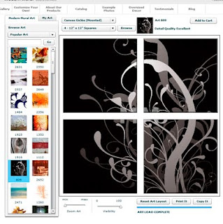
  1. Once on the “Design Your Own!” page, choose a layout for your art. After selection, the layout may be changed at any time by clicking the browse button located above the picture preview. There is no risk for low resolution, as the site will not allow you to continue if the resolution of the photo is too low to print on the chosen layout.
  2. Choose a design. There are three options: a) You can choose one of the many Modern Mural designs. All of the Modern Mural Art Collections are located on the left-hand side of the screen for you to browse through. b) You can upload your own high-resolution photo. To upload your own photo, click on the “My Art” tab and choose “Upload My Art!” You will then have the opportunity to browse your computer for the photo you wish to use. Keep in mind that high-resolution photos, for example, photos from an 8-megapixel camera, work best for this option. c) You can purchase images from other sites that may be uploaded and used to create a modern mural. Size requirements for these images are XL, XXL, or vector. Some examples of these web sites include: stockxpert.com, istockphoto.com, and fotolia.com
  3. Click on the thumbnail picture of your choice.
  4. Adjust the design. Your picture will appear in the large preview box in the center of the screen. At this point, you can use your mouse to drag the picture into the position you desire or use the Zoom Art and Visibility slider bars, located beneath the preview, to change the look. “Reset Art Layout” will return the picture to its original position.
  5. When you are satisfied with the design, click “Add to Cart” and you will be able to see a final preview of your art. Click “Add to Cart” again to place the order into your shopping cart, then “My Cart” at the top of the page to check out.

Congratulations! You have created your own customized wall décor. Your personalization, along with the superior quality of these wall prints, makes the artwork the ideal fusion for your stylish and smart lifestyle.

By guest writer, Sandy Randazzo, owner of www.youhavemywords.com